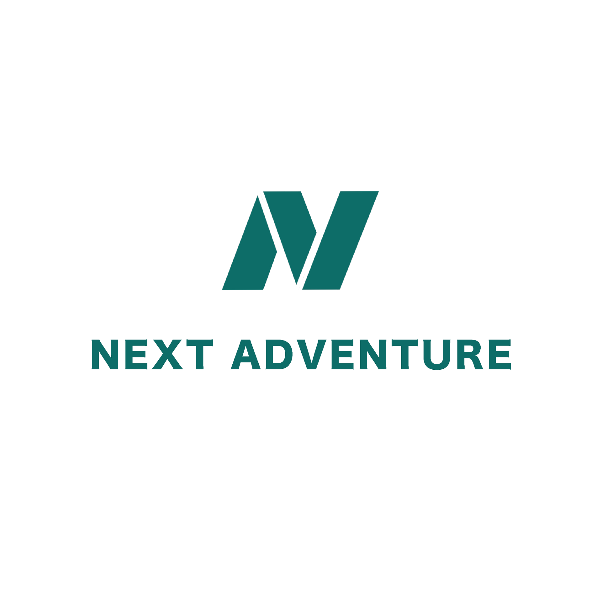
I chose a local Portland outdoor sports store called Next Adventure for my brand identity systems project. This particular project was all about redesigning a logo, making a brand guide stylescape, and designing merchandise that you would find in their store.
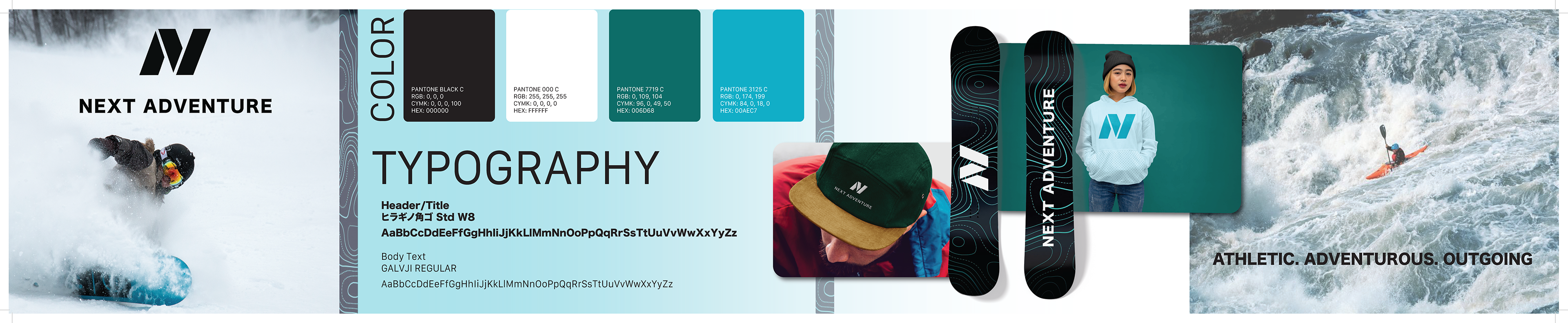
Next Adventure's current logo has a river, trees, and mountains all in the outline of a state park sign. My design is the letter N in the folds of a map. I did not use the letter A for 'Adventure' because it was too much and the abstractness spoke for itself.
As for the color palette, I did not want to use the exact same colors as the originals, but I wanted to stay on-brand with the "outdoorsy" aesthetic of Next Adventure.